# Styling & Components
Nodewood comes with a basic and flexible style that can be used to build your application without too much consideration about styling, while allowing you to modify the style as you choose.
While Nodewood is built with Tailwind CSS (opens new window) and allows you to very-specifically style every element to your heart's content, it also comes with a variety of components and styling tools to help speed up your development:
# Styling
# Vue Components
- Country Input
- State Input
- DropdownMenu
- DashboardStatLarge
- LoadingSpinner
- PaginationRow
- TextInput
- DataTable
# Basic Styling
Nodewood includes the Tailwind CSS Forms (opens new window) styling plugin by default, to provide some simple styling for basic components. In its own words, it provides a basic reset for form styles that makes form elements easy to override with utilities. Just adding the plugin adds some simple and pleasant styles that can act as a base for you to customize further.
Nodewood also includes the Tailwind Typography (opens new window) plugin, which can use to add beautiful typographic defaults to any vanilla HTML. The Nodewood software license modal dialog, for example, is styled with this plugin.
# Custom CSS
Nodewood relies on Tailwind CSS (opens new window), and the base CSS file for that resides at wood/ui/assets/styles/tailwind.css. To override it and inject your own styles, first, eject that file:
nodewood eject ui/assets/styles/tailwind.css
Then, fix the "include" functions in that file by replacing all instances of ./ with ../../../../wood/ui/assets/styles/ to point back to the original files in the wood folder.
From there, you can modify that file as you please.
# Colors
To modify the colors of your app, you can use Tailwind's color customization system (opens new window). This allows you to redefine any Tailwind color to be any HTML color you want.
For simplicity, Nodewood is built using the following custom color classes:
themeBackground: Used for background and border colors. Defaults tocolors.blueGray.themeForeground: Used for panel colors. Defaults tocolors.white.themePrimary: Used for primary buttons, links, and highlights. Defaults tocolors.blue.themeSecondary: Used for secondary buttons and links. Defaults tocolors.blueGray.themeCritical: Used for warning buttons, links, and text. Defaults tocolors.red.themeCelebratory: Used for celebratory text. Defaults tocolors.green.themeMoney: Used for money. Defaults tocolors.green.
Changing these colors to another color is as easy as extending the tailwind config file in app/tailwind.config.js and changing the color entries:
const colors = require('tailwindcss/colors');
const config = require('../wood/tailwind.config.js');

module.exports = {
  ...config,

  theme: {
    colors: {
      ...config.theme.colors,
      themePrimary: colors.red,
    },
  },
};
If you want to change individual #-level color values to ones not pre-defined by Tailwind, you can do that too:
theme: {
  colors: {
    ...config.theme.colors,
    themePrimary: {
      100: '#f7fafc',
      200: '#edf2f7',
      300: '#e2e8f0',
      400: '#cbd5e0',
      500: '#a0aec0',
      600: '#718096',
      700: '#4a5568',
      800: '#2d3748',
      900: '#1a202c',
    },
  },
},
To go any more specific than this, i.e. changing the colors of a single component feature, such as a border or background, you'll need to eject the component and override the classes yourself.
# Icons
Nodewood has the free version of FontAwesome 5.15.1 (opens new window) installed already. If you have a Pro version, you can remove the CDN link in app/ui/public/index.html, and follow FontAwesome's instructions on installing the Pro version (opens new window).
FontAwesome is a fairly simple-to-use (opens new window) package for displaying a wide variety of icons. For example, to display a solid camera icon, you would write:
<i class="fas fa-camera" />
Anywhere where you see an icon in Nodewood, it is likely coming from FontAwesome, especially if it follows the above format in the code. If so, you can change said icon by changing its name to any of the available icons (opens new window).
# Cards
When designing layouts, you'll frequently want to visually separate blocks from each other. Nodewood comes with a set of "card" classes to help with this. Add card, card-sm, or card-xs to add a base card styling to an element (with sm and xs having smaller padding and borders).
Then, within the card, you can add elements with card-header and card-body classes if you want add a title to said card:
<div class="card">
  <h2 class="card-header">Famous Dogs</h2>
  <div class="card-body">
    <ul>
      <li>Benji</li>
      <li>Laika</li>
      <li>Lassie</li>
      <li>Rin Tin Tin</li>
      <li>Toto</li>
    </ul>
  </div>
</div>
# Toasts
Occasionally, you will need to display the results of an action or temporary information. For this purpose, Nodewood uses the PrimeVue Toast (opens new window) component, accessible through some helper functions:
import { successToast } from '#ui/lib/toast';

// ...

successToast('Action complete.');
Toasts are available at 4 levels: successToast, infoToast, warningToast, errorToast.
# PrimeVue Components
Nodewood includes PrimeVue (opens new window) for the Dialog and Toast components, but is easy to use the remaining components, like their ColorPicker (opens new window) or Tooltip (opens new window).
# Nodewood Components
Nodewood comes with a selection of custom Vue components that can speed up development. You can view these components at wood/ui/components.
# Geography pickers
When looking to get a country or state from your user, you can use the CountryInput or StateInput components. These components rely on the wood/config/geography.js configuration file to display the countries/states in the dropwdowns, and come with a full selection of countries, and states for Canada/USA. If you prefer fewer countries or to add more states, you can
add an app/config/geography.js config file to override those settings to one more appropriate for your app.
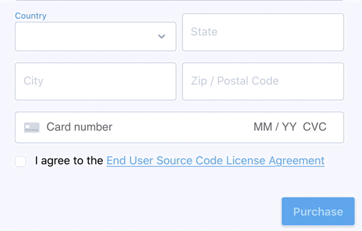
# CountryInput
This input is useful when needing to get a country from a user, for example during signup or configuration. Bind the input's v-model to a data property in your Vue component, and the 2-letter country code for the selected country will be stored there.
<country-input
  v-model="country"
  class="w-1/2 mr-2"
  label="Country"
  :error-text="countryErrorText"
/>
<script setup>
import { computed, ref } from 'vue';
import CountryInput from '#ui/components/CountryInput';

const country = ref('');
const countryErrorText = computed(() => 'computed error text that is displayed if non-null');
</script>
# Properties:
- label: A descriptive label.
- errorText: Error text to display on error.
- disabled: If the component is disabled.
# StateInput
This input is useful when needing to get a state/province from a user, for example during signup or configuration. Bind the input's v-model to a data property in your Vue component, and the state value will be stored there.
<state-input
  v-model="state"
  class="w-1/2 flex items-end"
  label="State"
  :error-text="stateErrorText"
  :country="country"
/>
<script setup>
import { computed, ref } from 'vue';
import StateInput from '#ui/components/StateInput';

const country = ref('');
const state = ref('');
const stateErrorText = computed(() => 'computed error text that is displayed if non-null');
</script>
# Properties:
- label: A descriptive label.
- errorText: Error text to display on error.
- disabled: If the component is disabled.
- country: If a country that has states defined in
#config/geography.js, display a select. Otherwise, display a TextInput.
# DropdownMenu
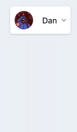
This collection of components can be used to create a drop-down menu, similar to the user menu in the upper-right of the Nodewood interface.
They are designed to work together, as in the following example:
<dropdown-menu
  menu-wrapper-classes="card-xs"
  menu-button-classes="card-body"
  menu-dropdown-classes="right-0"
>
  <template #menu-text>
  	User Name
  </template>

  <dropdown-menu-item :to="/profile">
    Profile
  </dropdown-menu-item>
  <dropdown-menu-item :to="/support">
    Support
  </dropdown-menu-item>

  <dropdown-menu-divider />

  <dropdown-menu-item :click="onLogout">
    Logout
  </dropdown-menu-item>
</dropdown-menu>
<script setup>
import DropdownMenu from '#ui/components/DropdownMenu';
import DropdownMenuItem from '#ui/components/DropdownMenuItem';
import DropdownMenuDivider from '#ui/components/DropdownMenuDivider';
</script>
# Slots:
- menu-text: The content provided to this slot is displayed in the dropdown before it is dropped down. In the case of the user menu, this is the user gravatar and user name.
- Default: Everything placed in the default slot will be displayed in the dropdown container.
# Properties:
- menuWrapperClasses: Classes to apply to the menu wrapper specifically.
- menuButtonClasses: Classes to apply to the menu button specifically.
- menuDropdownClasses: Classes to apply to the dropdown button container specifically.
# DropdownMenuItem
A menu item that can be clicked on to navigate or execute a custom function.
# Slots:
- Default: The content provided to this slot is displayed in the menu item. In the case of the user menu, these are the menu item labels.
# Properties:
- to: The URL to navigate to when this item is clicked. Optional, if not provided, ensure a
clickproperty is provided. - click: A function to execute when this item is clicked. Optional, if not provided, ensure a
toproperty is provided.
# DropdownMenuDivider
A divider item that can be used to separate related menu items.
# DashboardStatLarge

This component can be used to build dashboards, highlighting important statistics.
<dashboard-stat-large
  icon="fa-users"
  icon-color="text-blue-700"
  label="Total Users"
  :value="usersTotal"
/>
<script setup>
import { ref } from 'vue';
import DashboardStatLarge from '#ui/components/DashboardStatLarge';

const usersTotal = ref(66);
# Properties:
- icon: The font awesome icon name for this stat.
- iconColor: The tailwind colour for this icon.
- label: A descriptive label.
- labelClass: Classes for the label.
- value: The stat value.
- valueClass: Classes for the value.
# LoadingSpinner

When you need to show that an action will take some time, as in when you are loading data from the server, you can use the LoadingSpinner component, which provides a common indicator that can set user expectations. This can be combined with the loadable function from the vue-is-loading plugin, to make it easy to to display the loading spinner when you are fetching data or performing an action that will take some time.
<template>
  <div>
    <loading-spinner v-if="$isLoading('saveUser')" />

    <button @click="submit">
      Submit
    </button>
  </div>
</template>

<script setup>
import { ref, getCurrentInstance } from 'vue';
import { loadable } from 'vue-is-loading';
import LoadingSpinner from '#ui/components/LoadingSpinner';

const name = ref('');
const saveUser = loadable(
  (values) => store.dispatch('Users/saveUser', values),
  'saveUser',
  getCurrentInstance(),
);
const submit = async () => {
  await saveUser({ name });
};
</script>
This component exposes three props:
- iconClass: The fontawesome icon to display in the spinner. (opens new window)
- sizeClass: The size of the icon to display in the spinner. (opens new window)
- colorClass: A CSS class to use to adjust color for the spinner.
# PaginationRow

This component can help you when paginating large numbers of items, such as table rows.
<pagination-row
  :search-enabled="true"
  :page="page"
  :pages="totalPages"
  :per="per"
  @changePage="changePage"
  @changePer="changePer"
  @searchFor="searchFor"
/>
<script setup>
import { ref } from 'vue';
import PaginationRow from '#ui/components/PaginationRow';

const page = ref(1);
const per = ref(20);
const totalPages = ref(8);

const changePage = (newPage) => {
  page = newPage;
};

const changePer = (newPer) => {
  per = newPer;
};

const searchFor = (searchText) => {
  // change the search filter for the data
  // response will update page, per, and totalPages
};
</script>
# Properties:
- page: The current page.
- pages: The total number of pages.
- per: The number of entries per page.
- searchEnabled: If search bar is enabled.
- searchLabel: The label for the search text input.
# TextInput
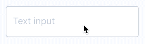
This component provides a text input with label and error text. Sure, you can always use the standard HTML input tag, but if you want something a little more stylish, you can use this!
<text-input
  v-model="coupon"
  label="Coupon Code"
  :error-text="couponErrorText"
  :disabled="isPurchaseUpdating"
/>
<script setup>
import { ref, computed } from 'vue';
import TextInput from '#ui/components/TextInput';

const coupon = ref('');
const couponErrorText = computed(() => 'compute error text based on validation/server response');
const isPurchaseUpdating = ref(false);
</script>
TextInputs will automatically attempt to submit any form they are in when "Enter" is pressed. In order to ensure that any errors this triggers are displayed, you will need to modify the submit function of your form to add any errors from this failed validation to apiErrors:
<template>
  <form @submit.prevent="submit">
    <text-input
      v-model="form.email"
      input-id="email"
      label="Email Address"
      :error-text="emailErrorText"
    />
  </form>
</template>

<script setup>
import { ref, computed } from 'vue';
import { deepUnref } from 'vue-deepunref';
import TextInput from '#ui/components/TextInput';
import { fieldErrorText, applyErrors } from '#ui/lib/forms';
import { UserValidator, LOGIN_FORM_FIELDS } from '#features/users/lib/validators/UserValidator';

const validator = new UserValidator(LOGIN_FORM_FIELDS);
const form = { email: ref('') };
const apiErrors = { email: ref([]) };

const emailErrorText = computed(fieldErrorText('email', validator, form, apiErrors));

const resetApiErrors = () => {
  apiErrors.email.value = [];
}

const save = (form) => {
  // save form
}

const submit = () => {
  resetApiErrors();

  if (! validator.valid(deepUnref(form))) {
    applyErrors(apiErrors, validator.errors(deepUnref(form), apiErrors));
    return;
  }

  await save(deepUnref(form));
}
</script>
# Properties
- inputId: The name to apply to the ID of the text input.
- label: A descriptive label.
- autofocus: If we should autofocus on the text input.
- errorText: Error text to display on error.
- disabled: If the component is disabled.
- type: The type of text input to use (text or password).
- value: The value of the text input.
# DataTable
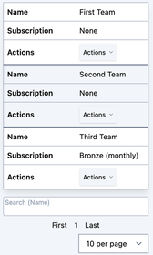
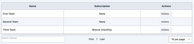
The DataTable component is designed for when you want to display lists of Model data in tabular format. It interacts with common store model loading patterns and will display nicely in either desktop or mobile mode.
<data-table
  :fields="EXAMPLE_MODEL_FIELDS"
  :rows="currentPage"
  :total-pages="totalPages"
  :search-enabled="true"
  :search-label="'Search (Name)'"
  :load-list="getList"
  :is-loading="$isLoading('getList')"
  :actions="teamActions"
  class="w-full"
/>
<script setup>
import { computed, getCurrentInstance } from 'vue';
import { useStore } from 'vuex';
import { loadable } from 'vue-is-loading';

const store = useStore();

const currentPage = computed(() => store.state.Teams.currentPage);
const currentPage = computed(() => store.state.Teams.totalPages);

const getList = loadable(
  (values) => store.dispatch('Teams/getList', values),
  'getList',
  getCurrentInstance(),
);

const openEditDialog = (team) => {
  // Open edit dialog
};

const openDeleteDialog = (team) => {
  // Open delete dialog
};

const teamActions = () => {
  return [
    { name: 'Edit', fn: openEditDialog },
    { name: 'Delete', fn: openDeleteDialog },
  ];
};
</script>
# Properties
- fields: The fields to display in the table header.
- rows: The rows of data to display.
- loadList: A function that can be used to manage the population and pagination of the list. If omitted, no search or pagination controls will be displayed.
- totalPages: The number of total pages for pagination.
- searchEnabled: If the search bar is enabled.
- searchLabel: What label text to display for the search bar.
- perPageOptions: A list of choice for items to display per page.
- isLoading: Controls if the loading overlay is displayed.
- actions: A list of actions that can be performed on each entry.
- actionsFn: A function that can be used to programmatically determine the actions that can be performed on each entry. The function is passed the current row as a parameter.
- emptyMessage: The message to display when there are no rows.
- showPagination: If the pagination row should be shown.